 |
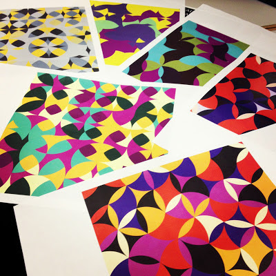
| Digital color studies for an initial critique... |
This 2D design class had my name written all over it. Those three words: Color, Pattern, & Symmetry, are probably the reasons that I chose to go to art school and pursue fashion design. Emilio Pucci was my first favorite designer, I was of course drawn by his iconic prints. The short of it is that there wasn't really a question as to whether or not I'd be taking this class.
 Through the semester my professor, Paul Corio, taught us in depth color theory and exposed us to the many ways that patterns are constructed. (Sanford Wurmfeld,his teacher's retrospective, that I blogged about, was a culmination of all the color theory I had been learning all semester). We explored tessellating patterns in black in white to begin, slowly he introduced specific color guidelines; our leash was loosened as the semester progressed and we were more knowledgeable about color. Understanding the power of color, like how to create the illusion of transparency (above)was key. It was crucial to have all the 'words' of color theory, tools in our tool boxes, before we were allowed to create our own vocabulary.
Hope you enjoy a peek into my 2nd semester of Foundation year at Parsons in 2D design! Learn more about the process and various projects below.
Enjoy,
Margo Isadora
The Process:
1) 5 or so digital studies were created for each assignment on Illustrator or Photoshop, and brought into class for an initial critique!
2) Once the study stage concluded we were sent off to mix our paints and replicate the digital design by hand.
Early on this hand driven method of reproduction felt laborious and time-consuming (especially with the 2-3 foot works)and didn't make much sense to me. By the end of the semester, as color came into the equation, I appreciated the work it had taken to learn to mix colors and become a skilled 2D (flat acrylic) painter.
3) Lastly came our final crit! It was always a treat to see the creative solutions that classmates came up with in response to the same assignment.
This project was the light and fade project... mixing tints and shades of the same hue to achieve the illusion of light with paint!
These paintings were 36"X6"!
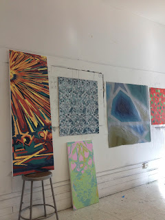
Final works hung at the crit
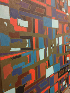
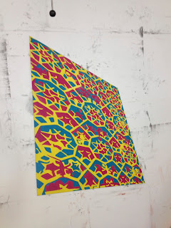
Our final project began at the Islamic wing at the Met. After our field trip we were challenged to create a large scale piece based on our sketches or photographs from the exhibit. I pentooled generalized shapes from an Islamic home and reflected it to create a pattern on Illustrator. It ended up as a 2.5'X2.5' acrylic painting on canvas. See the process and some of our final crit here!
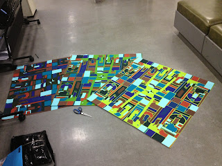 |
| Large digital prints from the plotter! Deciding on color... |
The long painting process...
I like to see how it came together once I'm done.
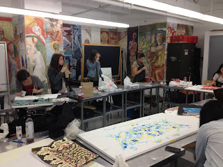 |
| Painting took place a little bit in class... |
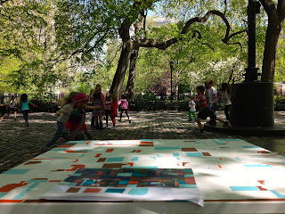 |
But mostly at home or in the park across the street!
(Loved watching little ones play as I worked!) |
 |
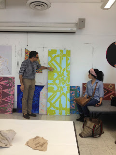
| Somehow it got finished for the crit! |
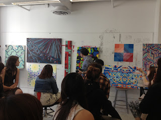 |
| Diverse ideas, all inspired by the same Islamic Wing! |
 |
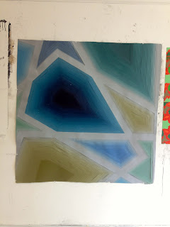
A very subtle approach
(All primary colors mixed with extreme amounts of white created an ethereal image!) |
 |
| Diverse works... my geometry didn't seem to reflect the curves and swirls present on the rest on my wall- love the contrast! |
 |
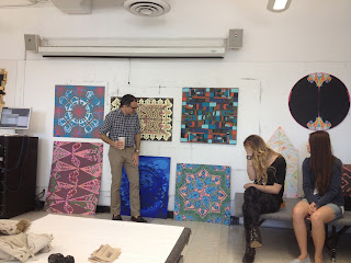
| More stunning solutions... |
 |
| This one has depth! The artist painted paper and painstakingly cut and layered her entire image! WOW!!! |
 |
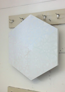
| The tricky perspective was enhanced by the canvas shape! Felt like it was leaning into the wall - too cool. |
 |
| Cool to be in a room where larger than life patterns graced the walls! |
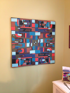 |
Mine became a thank you gift for my parents!
Share color and pattern with those in your life, it's sure to make them smile!
(p.s. click on any pictures to see larger) |


