Explore

Tuesday, July 30, 2013

An Engaging Exhibition: El Anatsui


El Anatsui's current exhibition, Gravity and Grace, at the Brooklyn Museum through August 18th, is truly a show not to MIS!  His monumental textiles and sculptures speak volumes, drawing visitors in for a closer look.  These works transcend most people's imagination, as far as the fate of their twist off bottle caps and tin cans go!  This contemporary African artist truly turns trash into treasure.   

Breathtaking blues spill onto the floor...

The most exciting thing for me, as a visitor, was how engaged everyone with the exhibit.  Usually, in a museum, there are those who look bored on a bench or are detached from the work, but Anatsui's work seemingly had the opposite effect. Each visitor seemed to have a connection to the work whether it was through their curious body language...


or their clothing!


His works are ever changing  with each new environment they travel to.  A security guard at the Museum explained to us that Anatsui let the curators place, hang, and shape his work how they so desired.  The artist only visited after to check in on his work and did not change a thing :)

You will leave this show with an uplifted spirit and a new perspective.  I recommend visiting on Saturday August 3rd at Target First Saturdays, which are always fun festivity filled evenings at the Museum!

Check it out before August 18th, learn more here!

Enjoy, 
Margo Isadora  


"Walls are meant to block views, but they only block the view of the eye - the ocular view - not the imaginative view.  When the eye scans a certain barrier, the eye tends to go beyond that barrier.  Walls reveal more than they hide." - El Anatsui

A Seemingly Tactile Painting...

Growing Tin Can Pipes

Labor that is well worth it... Stunning

She matches the work!

New perspectives in every fold...

Her black dress an sliver of red bag, could it get more perfect?!

A final monumental thought.

Friday, July 12, 2013

A Transformation: Vest to Backpack!


I was challenged to create a garment that transforms into a carrying case of some kind, in my 3D, Body as Form, class. I first made the muslin vest pattern then started the daunting transformation by returning to something I knew well, origami.  I figured some thoughtful folding and zippers could create the interesting streamlined bag I was envisioning!  

Can you incorporate the element of surprise (transformation) into your next project?! See how I did it below.

Enjoy,
Margo Isadora

p.s. click on photos to enlarge

Muslin pattern with basted on zippers after my origami play worked out!

Basted muslin backpack

The 'Origami' Instructions are easy enough!

Views of my drapey vest!

(As one can see in the directions the grey strip at the bottom of the vest was a design element that also helped clarify the first folding directions. Transformative design needs to function!)

All zipped up... no vest to be seen!

A delicious drape

She can't wait till the weather's cool so she can be worn again!

Saturday, June 15, 2013

DIY: Paper Towel Roll Wall Art


As I prepare to move into my first apartment, at the end of the summer, I've been thinking a lot about what I want to incorporate to make my new space feel like home.  Some DIY wall art felt like a necessity.  

I've had a collection of paper towel & toilet paper rolls lying around from another DIY project- so armed with a stapler, scissors and spray paint I decided to give it a go!


I cut the rolls into 1" rings and worked with the stapler to attach them together, creating more densely packed flower and leaf motifs in areas to add visual interest. To finish it off I sprayed it silver and a clear matte acrylic, to add further stiffness and durability. See the full picture tutorial below.

The 3D wall art created the interesting shadow that I was hoping for.  Hang it on a nail, and change the loop that it rests on until you are satisfied- the variety of orientations create endless works of art!

Enjoy creating fun art for your walls,
Margo Isadora

1.Cut up your tubes into 1" rings.

2. Staple them together. Get creative- the size of the stapler sometimes makes connections difficult. 

3. Continue working until you're pleased with the size of your artwork.

4. Head outside or to an extremely ventilated area to spray!

5. Spray away.  I chose a metallic, but a vibrant color could be a great accent to a white wall.

6. Let dry outside for a day, those spray paint fumes take a while to dissipate.   

7. Hang your new DIY wall art in a cozy spot!

Enjoy the depth it adds to your wall and the beautiful shadows it spreads!

Saturday, June 8, 2013

Instagram: Don't MIS It


I constantly take pictures in order not to MIS, or forget, things that surround me.  Instagram has allowed me to make sure that you don't MIS the adventures I have or things I create.  I've included a handful of my images in this post; a picture says a thousand words, so I'll let them do all the talking!


To stay in the loop with my current projects and findings, and for when I'm not blogging, check out Don't MIS It on Instagram here!

Be inspired by all that is around you,
Margo Isadora


Wednesday, June 5, 2013

Color, Pattern, & Symmetry

Digital color studies for an initial critique...

This 2D design class had my name written all over it.  Those three words: Color, Pattern, & Symmetry, are probably the reasons that I chose to go to art school and pursue fashion design.  Emilio Pucci was my first favorite designer, I was of course drawn by his iconic prints.  The short of it is that there wasn't really a question as to whether or not I'd be taking this class.

Through the semester my professor, Paul Corio, taught us in depth color theory and exposed us to the many ways that patterns are constructed.  (Sanford Wurmfeld,his teacher's retrospective, that I blogged about, was a culmination of all the color theory I had been learning all semester). We explored tessellating patterns in black in white to begin, slowly he introduced specific color guidelines; our leash was loosened as the semester progressed and we were more knowledgeable about color.  Understanding the power of color, like how to create the illusion of transparency (above)was key.  It was crucial to have all the 'words' of color theory, tools in our tool boxes, before we were allowed to create our own vocabulary.

Hope you enjoy a peek into my 2nd semester of Foundation year at Parsons in 2D design! Learn more about the process and various projects below.

Enjoy,
Margo Isadora 

The Process:

1) 5 or so digital studies were created for each assignment on Illustrator or Photoshop, and brought into class for an initial critique! 

2) Once the study stage concluded we were sent off to mix our paints and replicate the digital design by hand.  
Early on this hand driven method of reproduction felt laborious and time-consuming (especially with the 2-3 foot works)and didn't make much sense to me.  By the end of the semester, as color came into the equation, I appreciated the work it had taken to learn to mix colors and become a skilled 2D (flat acrylic) painter.  


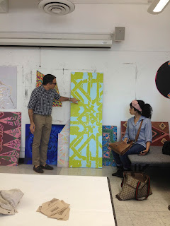
3) Lastly came our final crit! It was always a treat to see the creative solutions that classmates came up with in response to the same assignment.


This project was the light and fade project... mixing tints and shades of the same hue to achieve the illusion of light with paint!


These paintings were 36"X6"!
Final works hung at the crit


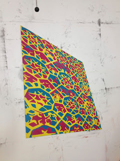
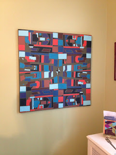
Our final project began at the Islamic wing at the Met.  After our field trip we were challenged to create a large scale piece based on our sketches or photographs from the exhibit.  I pentooled generalized shapes from an Islamic home and reflected it to create a pattern on Illustrator.  It ended up as a 2.5'X2.5' acrylic painting on canvas.  See the process and some of our final crit here!  

Large digital prints from the plotter! Deciding on color...

 The long painting process...
 I like to see how it came together once I'm done.

Painting took place a little bit in class...

But mostly at home or in the park across the street!
(Loved watching little ones play as I worked!)

Somehow it got finished for the crit!

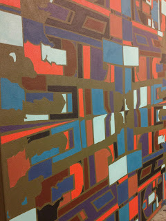
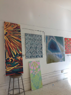
Diverse ideas, all inspired by the same Islamic Wing!

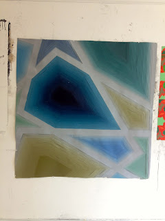
A very subtle approach
(All primary colors mixed with extreme amounts of white created an ethereal image!)

Diverse works... my geometry didn't seem to reflect the curves and swirls present on the rest on my wall- love the contrast!

More stunning solutions...

This one has depth!  The artist painted paper and painstakingly cut and layered her entire image!  WOW!!!

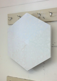
The tricky perspective was enhanced by the canvas shape!  Felt like it was leaning into the wall - too cool.

Cool to be in a room where larger than life patterns graced the walls!

Mine became a thank you gift for my parents!

Share color and pattern with those in your life, it's sure to make them smile!


(p.s. click on any pictures to see larger)